


A kitchen counter is not neutral ground anymore. It is where taste, habit, family routines, and a small bit of identity all sit in plain view. That is why the Color Collection from KitchenAid has people watching restocks with the same focus usually saved for sneakers or concert tickets. For U.S. buyers, the excitement is not only about a mixer looking pretty on a marble island. It is about picking a shade that feels current without turning the kitchen into a trend trap. KitchenAid has confirmed Spearmint as its 2026 Color of the Year, describing it as a light mint green with a tactile sandy finish, while its broader color pages also show new Artisan Plus shades such as Sun Dried Tomato, Wild Blueberry, and Iron Ore Bronze. That matters because appliance color is no longer an afterthought. It can shape how a kitchen feels every morning. For readers tracking product drops through home product trend updates, this is the kind of launch that shows how design, scarcity, and everyday cooking now overlap.
Why the Color Collection Became a Kitchen Status Signal
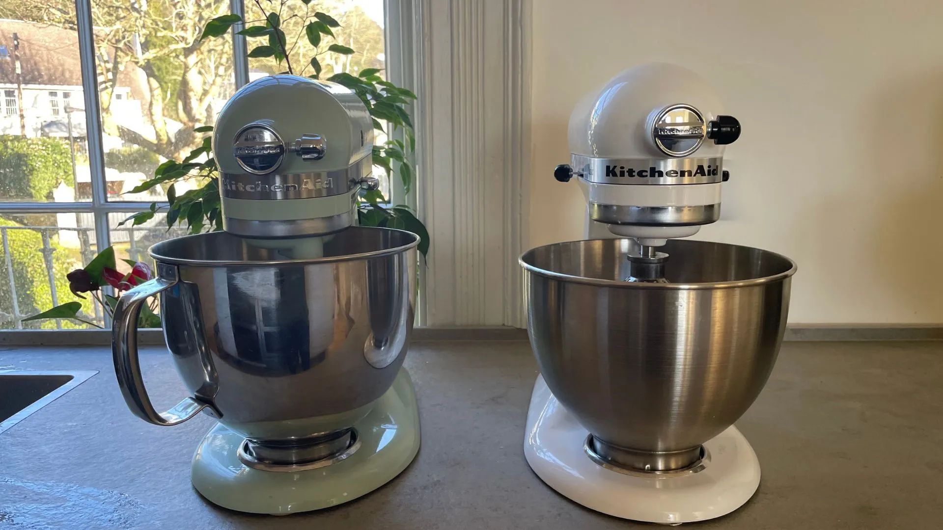
KitchenAid did not stumble into color by accident. The brand points back to 1955 as the year it introduced stand mixer colors, which helped turn a practical appliance into something people wanted to leave on the counter. That old move still matters because most countertop appliances fail the “leave it out” test. They work fine, then get shoved into a cabinet. A KitchenAid mixer is different. It is heavy, visible, and tied to baking memories, holiday prep, and weekend projects. Once a product lives in the open, the shade becomes part of the room.
Why buyers treat mixer shades like decor choices
A stand mixer is not a phone case. You do not swap it every few months. That is why people pause over KitchenAid stand mixer colors longer than they might admit. A soft green, deep red, or smoky bronze can either calm the kitchen down or pull the eye toward one bright corner.
The non-obvious part is that color can make a practical product feel easier to justify. A buyer may tell themselves they need the motor, bowl size, and attachments. Still, the final click often happens because the appliance looks like it belongs in the home they are trying to build. Function opens the door. Color closes the sale.
Think about a first apartment in Chicago with white cabinets and butcher block counters. A stainless toaster blends in. A Spearmint KitchenAid mixer changes the whole counter without repainting, renovating, or buying new tile. That is the hidden power of a shade drop. It gives renters and homeowners a low-commitment way to make the room feel chosen.
Why scarcity makes a familiar appliance feel new
The mixer itself is familiar. That is the twist. KitchenAid does not need to teach shoppers what a stand mixer does, because the product already has a place in American kitchen culture. Scarcity works here because the base object is trusted.
A limited edition mixer creates a different kind of pressure than a normal appliance sale. Shoppers are not only asking, “Do I need this?” They are asking, “Will I regret missing this exact shade?” That small fear can speed up a purchase more than a discount.
This is also why the resale and collector mindset creeps into kitchen goods. A color that feels rare can become a talking point. Maybe it never rises in value. Maybe it does. Either way, it gains emotional weight. A mixer that could have been a tool starts to feel like a piece of the kitchen’s story.
What the New KitchenAid Shades Say About U.S. Kitchen Taste
The newer KitchenAid shades speak to a bigger shift in American homes. White kitchens are still common, but many people are tired of rooms that feel staged instead of lived in. Spearmint, Sun Dried Tomato, Wild Blueberry, and Iron Ore Bronze work because they offer personality without requiring a full design redo. KitchenAid’s official color pages describe Spearmint as crisp and clean, while the Artisan Plus listings frame the other shades around richer, moodier finishes.
Why soft color beats loud color for most counters
A bright appliance can look fun online and harsh at home. That is the trap. Kitchens have daylight, overhead light, cabinet undertones, metal finishes, wood grain, and backsplash texture. A shade that screams in a product photo can fight with all of that once it lands on the counter.
That is why Spearmint makes sense. It has a fresh look, but it is not neon. It can sit near white subway tile, pale oak, black stone, or brass hardware without turning the whole kitchen into a theme. The same logic helps Wild Blueberry and Iron Ore Bronze. They give depth without shouting.
The best KitchenAid stand mixer colors act like good paint colors. They change through the day. Morning sun may make a mint shade feel clean and bright. Evening light may soften it. That movement matters more than people think, because the appliance is seen in real life, not only on a product page.
Why the safest shade is not always the smartest buy
Many buyers default to black, white, or stainless because those choices feel safe. Sometimes that is wise. But safe can also become forgettable. If the mixer stays on display, a more personal shade may age better because it carries intent.
Here is the counterintuitive part: a bold color can feel less trendy than a safe neutral when it connects to the owner’s actual style. A mint mixer in a vintage-inspired kitchen may still look right ten years from now. A gray mixer bought only because gray felt safe may look tired sooner.
For a Phoenix homeowner with warm tile floors and cream cabinets, Sun Dried Tomato could add the right grounded note. For a Boston condo with navy lowers and white counters, Wild Blueberry might feel steady instead of flashy. Matching does not mean copying every tone. It means choosing a shade that speaks the same language as the room.
How Smart Buyers Should React Before the Next Restock
A fast drop can make people sloppy. That is where mistakes happen. The smartest buyer does not chase a shade blindly. They decide ahead of time which finish works, what size they need, where the mixer will sit, and what price feels fair. Then they move fast only when the right product appears.
Check the model before you chase the shade
Color gets attention, but model choice affects daily use. A pretty mixer that is too small, too large, or wrong for your baking habits becomes counter clutter with a nice finish. The color should be the final filter, not the first one.
Most home cooks should think through three plain questions. Do you bake once a month or every weekend? Do you make cookies and cakes, or heavier doughs? Will the mixer live on the counter, or will you lift it from a lower cabinet? That last question matters because stand mixers are not lightweight gadgets.
A limited edition mixer can still be the wrong buy. That sentence saves money. If you only want the shade because everyone else wants it, pause. If you already wanted that model and the new finish fits your kitchen, move quicker.
Watch official stock before trusting social buzz
Social posts can make any product feel impossible to get. Sometimes the buzz is accurate. Sometimes it is noise created by screenshots, affiliate posts, and people reacting to the same few images. Official product pages remain the cleanest place to confirm what exists, what is available, and how the brand describes the finish.
KitchenAid’s official Spearmint product listing identifies the 2026 Color of the Year mixer as model KSM195PSSD, while the brand’s color page presents Spearmint as part of its Color of the Year program. That kind of detail matters when similar shades circulate online under casual names.
For shoppers building a larger kitchen plan, it also helps to compare this purchase with other design choices. A mixer shade should work with your cabinet color, lighting, and storage habits. You can pair this decision with small kitchen storage ideas or modern appliance buying guides before you spend.
What This Drop Reveals About Appliance Marketing
The most interesting part of this launch is not that people like a new shade. People have always liked pretty things. The bigger lesson is that kitchen appliances are now marketed like lifestyle objects, and shoppers have accepted that trade. They want performance, but they also want feeling.
Why the mixer became a mood object
A stand mixer sits at the center of a certain kind of kitchen dream. It suggests baking on Sundays, hosting without panic, making dough from scratch, and having enough counter space to leave something beautiful out. Even people who bake twice a year understand the image.
That image is powerful because it is domestic but aspirational. It does not feel as distant as a luxury range or custom cabinets. A mixer is expensive enough to feel special, but still reachable for many households during a sale, gift season, or personal milestone.
The Spearmint KitchenAid mixer fits that mood well because it carries a clean, fresh feeling without looking cold. KitchenAid says its Color of the Year process draws from broader global trends and aims to capture the current moment. That language may sound like design talk, but the buyer version is simpler: people want kitchens that feel alive again.
Why the best launch may be the one that sells slowly after the rush
A sellout headline creates heat, but a product’s real strength shows after the first rush cools. If people keep searching for the shade weeks later, the color has moved beyond hype. If they forget it once the first posts fade, the launch was only a moment.
That is the quiet test for any limited edition mixer. Does it still feel right when there is no countdown, no cart panic, no friend sending a link? A good appliance color should survive ordinary Tuesday light. It should still look at home next to coffee grounds, lunch boxes, and the mail pile.
For KitchenAid, the win is not only selling through stock. It is training buyers to watch color drops as events. Once shoppers believe a shade can disappear, they return sooner next time. Scarcity becomes a habit loop, and the counter becomes the stage.
Conclusion
KitchenAid’s latest shade push shows how much emotion now sits inside ordinary kitchen purchases. Buyers are not only comparing watts, bowl capacity, or attachment options. They are asking whether an appliance feels like part of the home they want. That is why the Color Collection has so much pull, even among people who already own a mixer. Still, the smartest response is not panic buying. It is preparation. Know the model you want, check the official listing, and choose a shade that works with your real kitchen instead of a product photo. A color drop can be fun, but the mixer has to live with your cabinets, your light, and your habits. Buy the one you will still enjoy when the hype goes quiet.
Frequently Asked Questions
How do I know if a new KitchenAid color is worth buying?
Buy it if the model fits your cooking habits and the shade works with your kitchen. Do not buy only because stock looks limited. A mixer is too large and too expensive to become a regret purchase after the online buzz fades.
Is the Spearmint KitchenAid mixer a good choice for white kitchens?
Yes, it can work well because mint green adds color without overpowering white cabinets or pale counters. It looks best when the room has a few natural textures nearby, such as wood, stone, woven shades, or warm metal hardware.
What are the best KitchenAid stand mixer colors for resale appeal?
Classic shades such as red, black, white, and stainless often appeal to the widest buyer pool. Limited shades can attract collectors, but resale demand is harder to predict. Choose for your kitchen first, not for a future listing.
Should I wait for a KitchenAid restock or buy another shade now?
Wait if your preferred shade is the main reason you want the mixer. Buy another shade only if the model, price, and finish already make sense. Settling on color can bother you more when the appliance stays visible every day.
What makes a limited edition mixer different from regular models?
The difference is usually the finish, shade, packaging, or release window, not always the core mixing function. Read the model details before buying. A limited finish may look special, but the specs still need to match your needs.
Can a colorful stand mixer work in a small apartment kitchen?
Yes, especially when the rest of the room is simple. A colorful mixer can act like decor and save you from adding extra countertop items. The key is choosing one accent shade rather than crowding the space with competing colors.
Where should I check first for new KitchenAid color drops?
Start with KitchenAid’s official website because it gives the cleanest product names, model details, and availability notes. Retailers and social posts can help you spot demand, but official pages reduce confusion around shade names and versions.
Are KitchenAid color drops only for serious bakers?
No. Serious bakers care most about performance, but casual cooks may value the design even more because the mixer stays on display. The best purchase sits in the middle: useful enough to earn its space and attractive enough to enjoy daily.